ReportLab Chart Galleries
ReportLab includes a flexible and powerful graphics library, supporting all of the standard business chart types, as well as custom data graphics.
Every graphic is a Python class that “knows how to render itself”. It can be drawn as a vector in a PDF, meaning infinitely sharp lines and small file sizes; and also output as bitmaps or SVG for web use. You can fully control typography, positioning and spacing, to make sure a chart perfectly matches the enclosing document.
On the left menu you can browse through a gallery of different charts, and see the source code and settings to produce them.
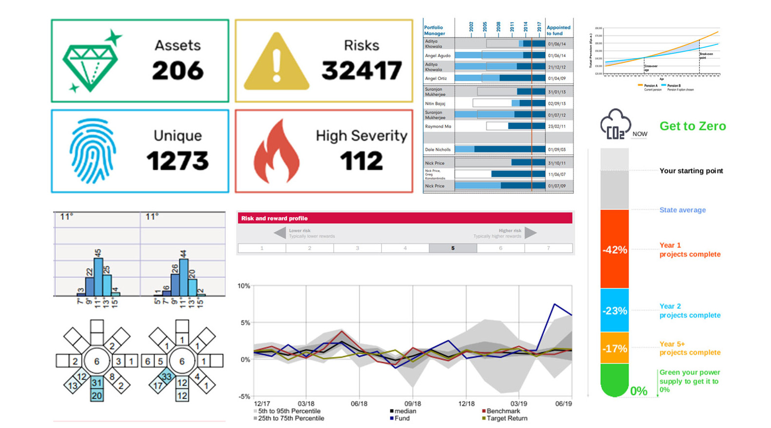
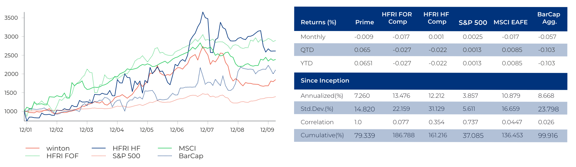
Whether you need standard charts creating quickly and precisely, or whether you need something non-standard to visualise your data, please get in touch and we’ll give you a quotation to realise your graphic. You can then re-use this component with dynamic data in any of your reports. The picture below shows a montage of custom data graphics we have made for people recently...